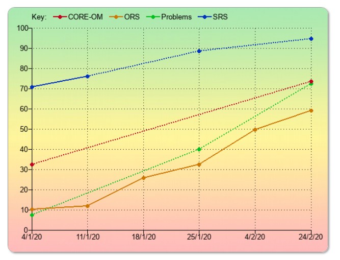
Chart overview
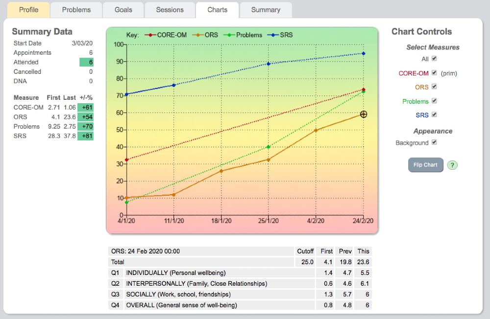
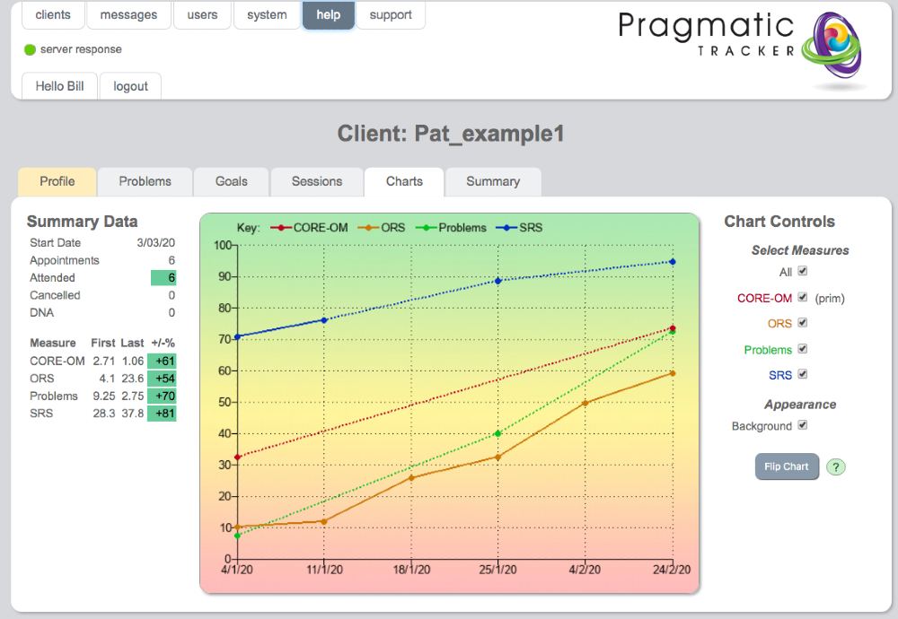
The chart provides a wealth of information about the client journey. All measures used with the client at any session are available to view. When all measures are viewed together the scores are standardised on a % basis so the Y axis scores from 0 to 100. This gives an overall impression of the relative progress made on different measures. Each measure is colour coded and the key is offered at the top of the chart. The session date is along the X axis.

Learn all about the progress chart (4mins 20 secs)
Chart controls
To the right of the chart are the chart controls. This determines what's displayed on the chart.
One can choose to view all measures or any combination of measures. When 1 measure alone is chosen the page refreshes and the Y axis changes to the correct scoring range for that measure. If the measure has a known cut-off this is displayed as a dotted line. Background appearance can be altered to show or hide colour.
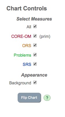 When 'All' is chosen the chart can be flipped so green is at top or bottom. When any 1 item is chosen its components can also be displayed. Any combination of elements can be displayed simultaneously.
Goals on the chart
The 'goals' measure that you create displays like any other measure on the chart. You can view it as an aggregated score and also view the individual goals.
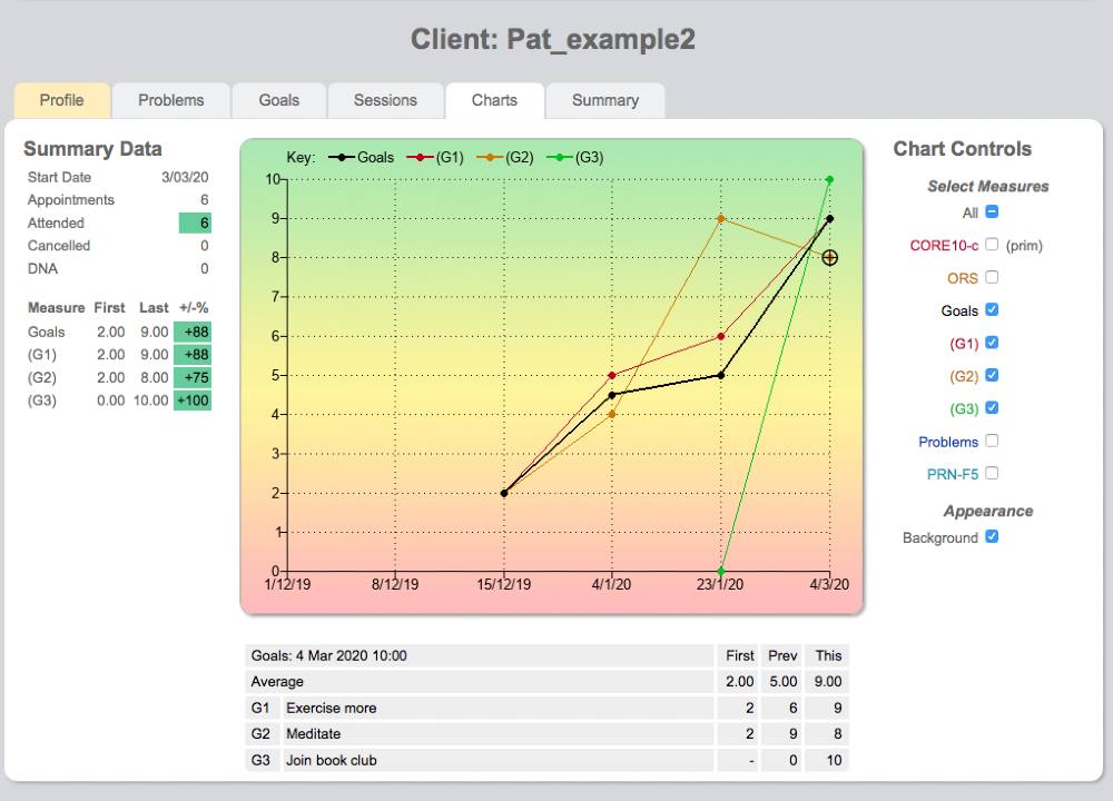
NOTE. "Problems' display similar to 'Goals' on the chart.
Summary data
To the left of the chart summary data provides a useful reminder of the start date, no. of appointments booked, attended, cancelled or DNA.
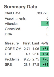
All measures used are listed, with their corresponding first scores and most recently available scores (last). The % improvement of the score from its original value is offered and colour coded depending on the degree of improvement.
The colour coding is simple and of immense clinical value when used correctly; RED means no change or deterioration; AMBER means some change; GREEN means substantial change. It's important to be guided by the colour, NOT by the %
Colour coding
Because ANY measure can be used in Pragmatic Tracker, including completely new 'Problems' or 'Goals' measures we needed to devise a simple way of representing meaningful change that would be clinically relevant to clients and treating practitioners.
To understand how we calculate change click here for a detailed explanation of our traffic light system.
How 'Problems' display on charts (1 min 30 secs)
Chart lines
When a measure is not scored continuously at every session the chart lines are dotted.
The key explaining each measure colour is at the top of the chart and that colour is maintained in the chart control panel.
![]() Flipping the chart (1 min 40 secs)
Flipping the chart (1 min 40 secs)
Table below chart
Clicking on any particular scoring point on the chart will display a drop-down table below the chart.
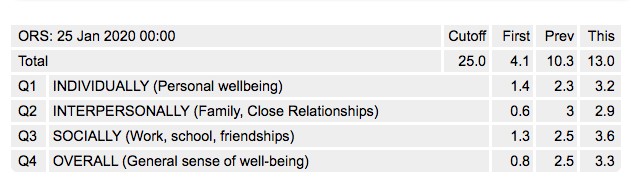
This displays the individual item responses and on the right side it offers 3 scores: the 1st available; the previous score to 'This' session (whichever scoring point you have chosen) and 'This' score. This allows you and your client to compare how particular items have changed between sessions.
How goals display on charts (3 mins)
Displaying the table
In this example below, the ORS scoring point on 24/02/2020 has been clicked and the table displayed below the chart.The item responses are displayed, with their corresponding 'First', 'Previous' and 'This' item scores. This allows client and practitioner to discuss the responses.