
![]() The chart provides a wealth of information about the client journey. All measures used with the client at any session are available to view. When all measures are viewed together the scores are standardised on a % basis so the Y axis scores from 0 to 100. This gives an overall impression of the relative progress made on different measures. Each measure is colour coded and the key is offered at the top of the chart. The session date is along the X axis.
The chart provides a wealth of information about the client journey. All measures used with the client at any session are available to view. When all measures are viewed together the scores are standardised on a % basis so the Y axis scores from 0 to 100. This gives an overall impression of the relative progress made on different measures. Each measure is colour coded and the key is offered at the top of the chart. The session date is along the X axis.
|
If a measure has not been offered at every session the connecting line will appear dotted. Hovering over any measurement point one can see the date of entry, the name of the measure and the precise score. Clicking on a measurement point will open a dropdown table below the chart displaying all of the items and colour coding the components (if components are available for that measure). Note that the date of entry may differ from the corresponding session date if the measure was not scored on the same date, for example, if a client filled in a measure before a session date or a practitioner carried out paper entry after a session date.
|
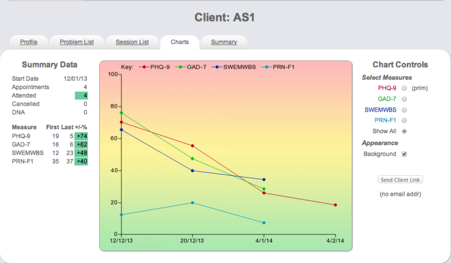
To the left of the chart summary data provides a useful reminder of the start date, no. of appointments booked, attended, cancelled or DNA. All measures used are listed, with their corresponding first scores and most recently available scores (last). The % improvement of the score from its original value is offered and colour coded depending on the degree of improvement.
To the right of the chart one can choose to view all measures or just 1 particular measure. When 1 measure is chosen the page refreshes and the Y axis changes to the correct scoring range for that measure. If the measure has a known cut-off this is displayed as a dotted line. Background appearance can be altered to show or hide colour.